

Waxnote
Rediscover your playlists. An editorial music concept built around six of my Spotify playlists.
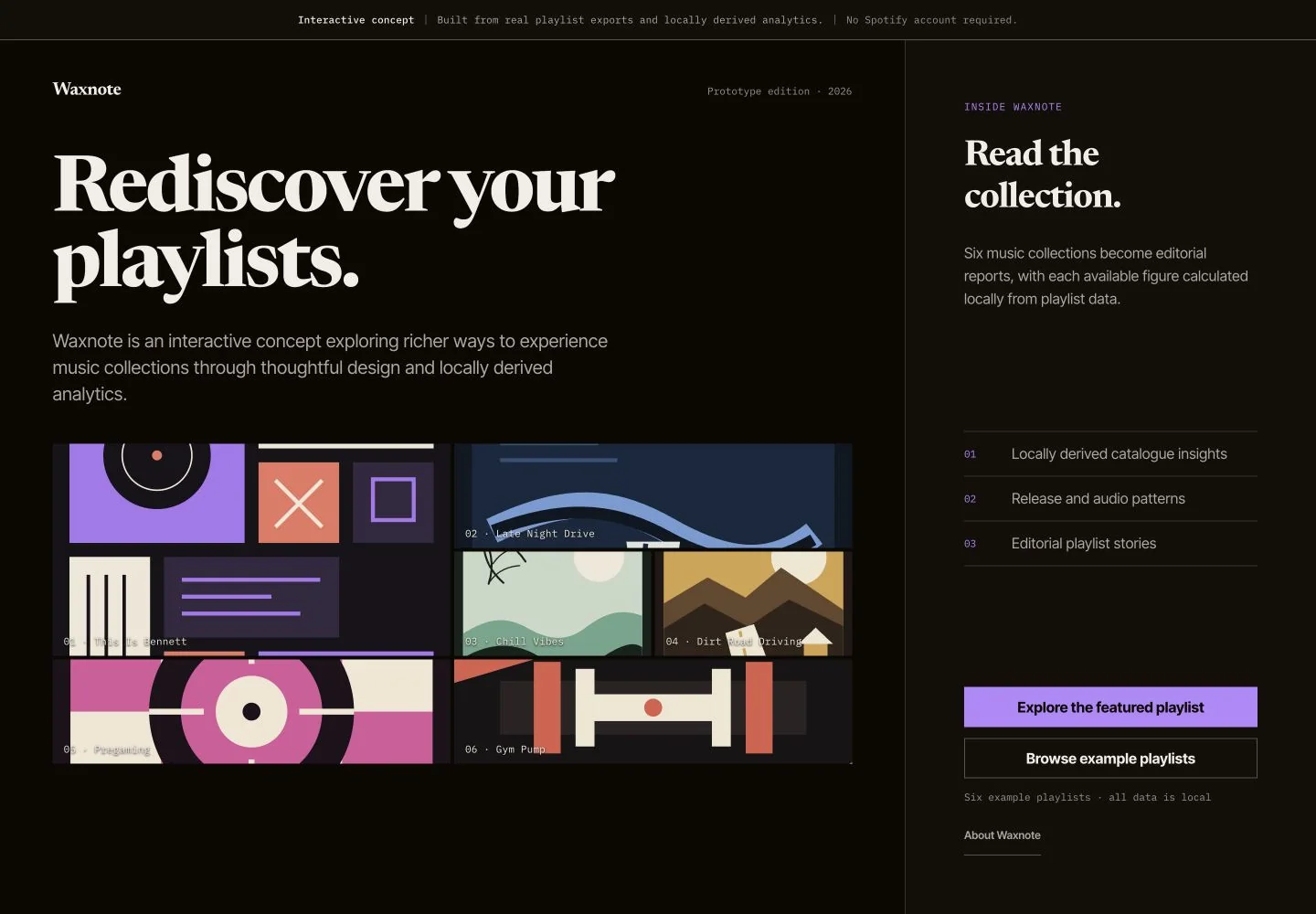
Editorial music analytics
I built Waxnote around six playlists I created on Spotify. Each one becomes an editorial report spanning Overview, Catalog, Audio, and Wrapped.
The reports explore runtime, artists, genres, release patterns, popularity, musical keys, and audio features. No Spotify account connection or backend service is required to explore the included playlists.
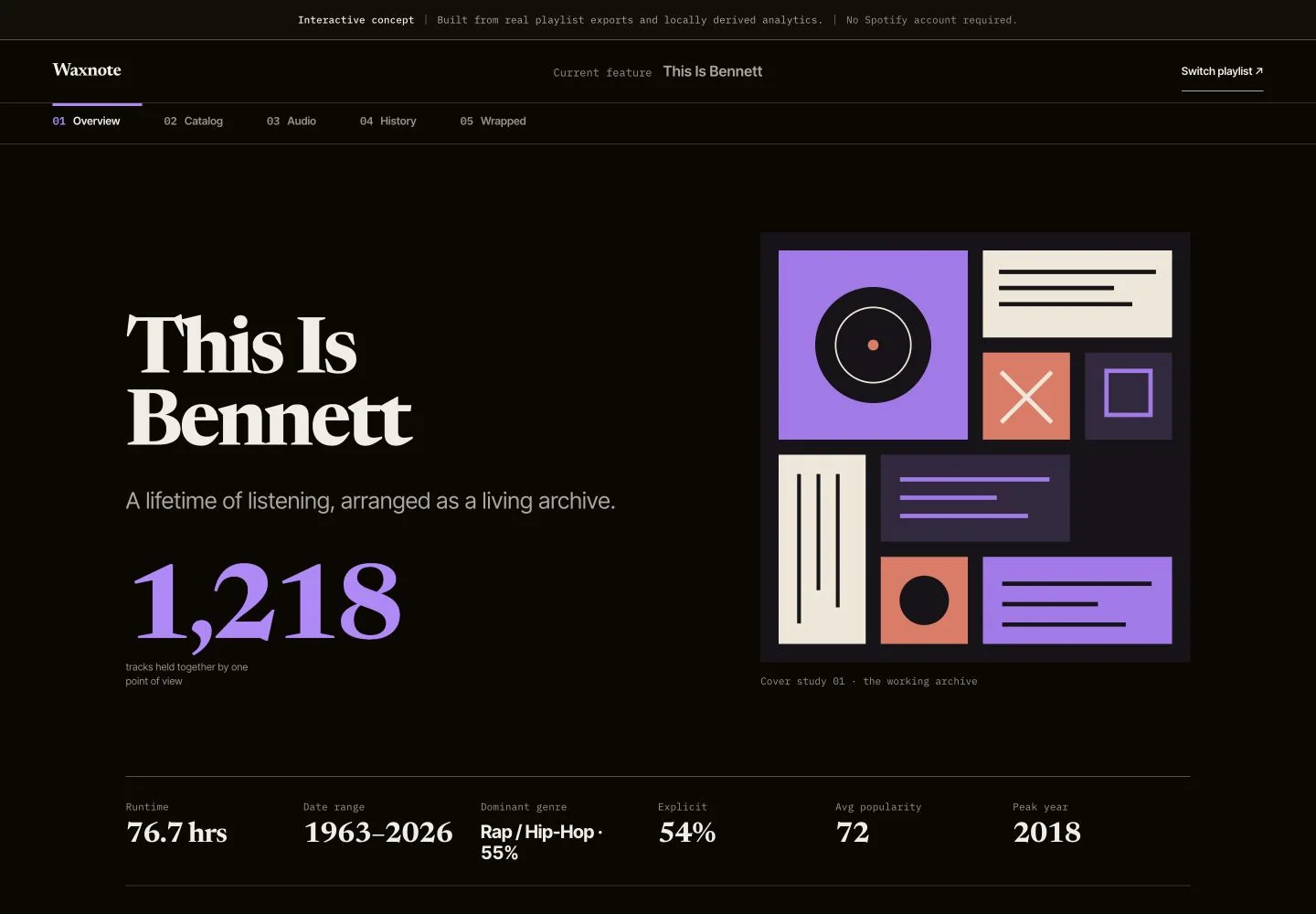
Beyond the dashboard
I wanted to explore richer ways of understanding music collections beyond conventional analytics dashboards. The goal was something that felt less like a database readout and more like flipping through a designed music publication about your own taste.
Working with the available data
Waxnote began as a Spotify-powered analytics idea. Limitations on the planned live features led me to pivot toward a frontend-only concept. That changed how the prototype obtained its data, not whether saved audio-feature values could be used.
For five of the playlists, I built the concept around saved playlist data rather than a live Spotify connection. The imported CSVs already contain audio-feature values, including energy, danceability, valence, tempo, and key. Waxnote summarizes those saved values in the browser instead of fetching them live or calculating them from audio recordings. These exports contain 433 playlist entries, with some tracks appearing in more than one playlist.
For my featured “This Is Bennett” playlist, the report reads its summaries, chart values, and Wrapped content directly from values stored in the application source. Its displayed count is 1,218 tracks. These report values are not calculated from the five imported CSVs.
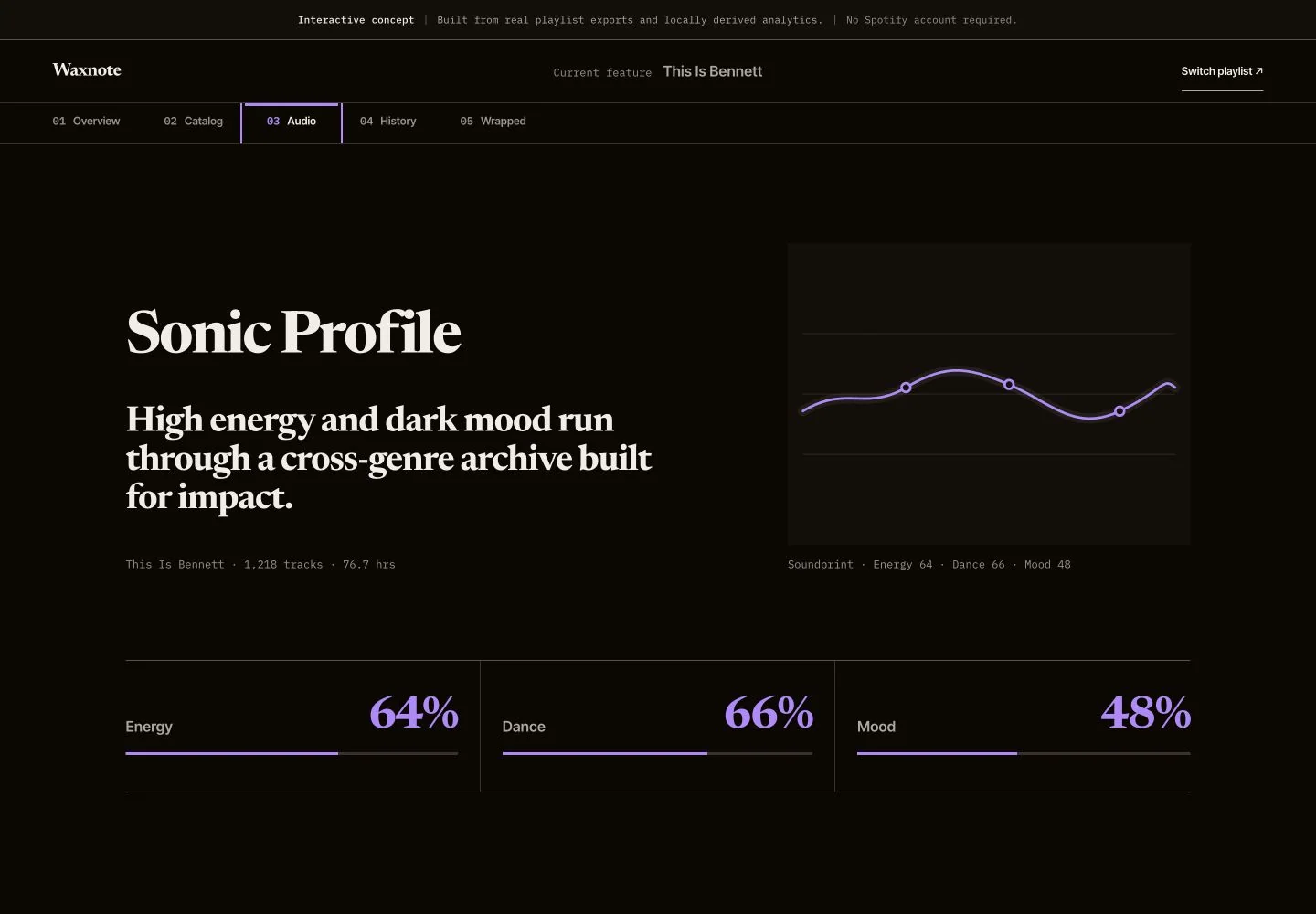
A music publication
Waxnote's visual language draws from editorial layouts, music magazines, and annual reports rather than conventional analytics dashboards. Newsreader gives headlines and large statistics a print-like character, while a restrained interface type system keeps navigation and metadata clear. The palette combines near-black, warm white, and lavender with playlist-specific accent colors. Generous spacing, oversized figures, thin rules, and subdued motion reinforce the feeling of browsing a designed music publication.
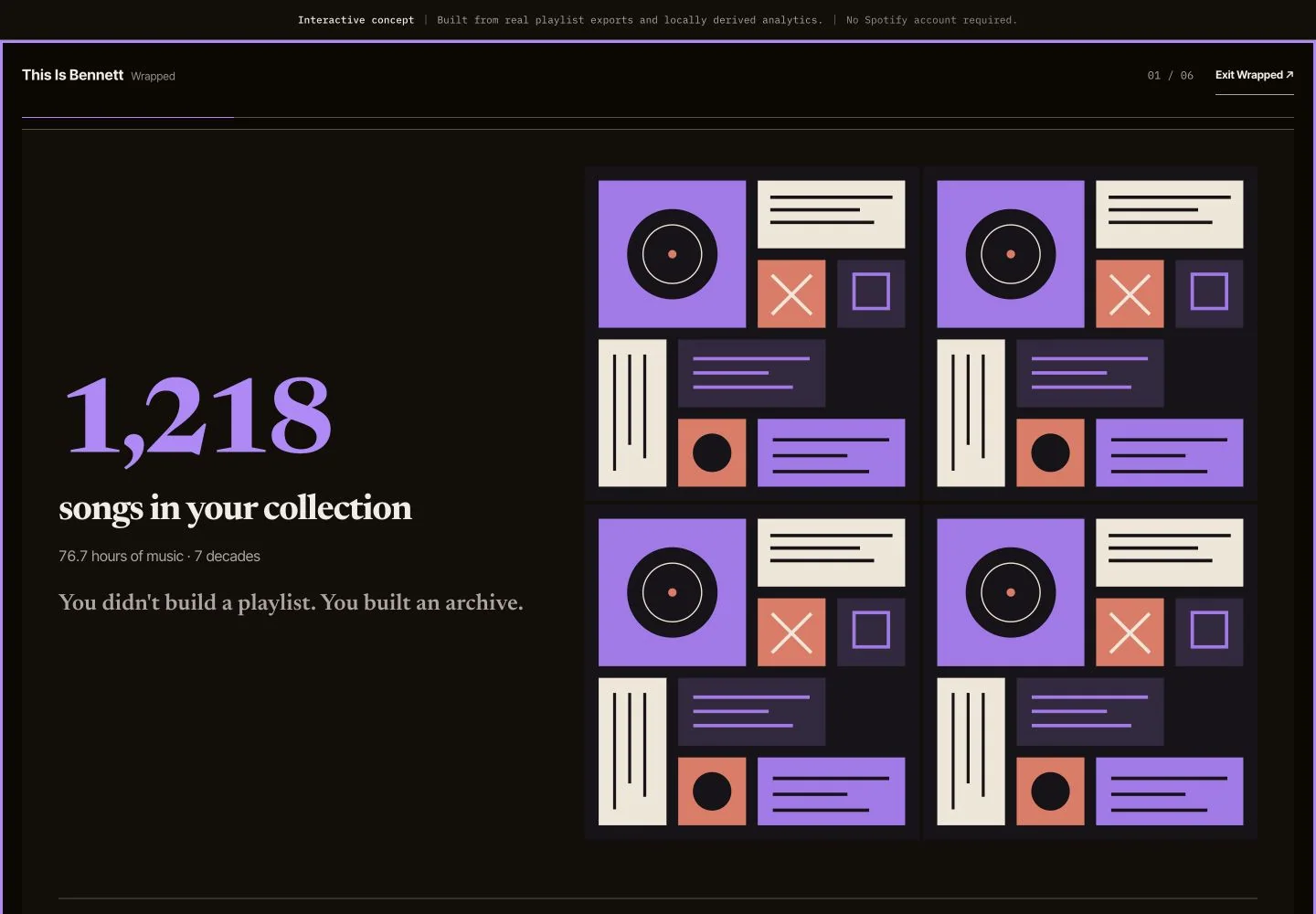
Design system
- Display type Newsreader
- Interface type Sans system
- Base Near-black / warm white
- Primary accent Lavender
- Artwork tones Coral · cream · blue · pink
- Motion Crossfades · reduced-motion
Engineering
- Framework React
- Build Vite
- Charts Recharts
- Data Saved playlist data
- Analytics Browser calculations + stored summaries
- Layout Responsive · accessible
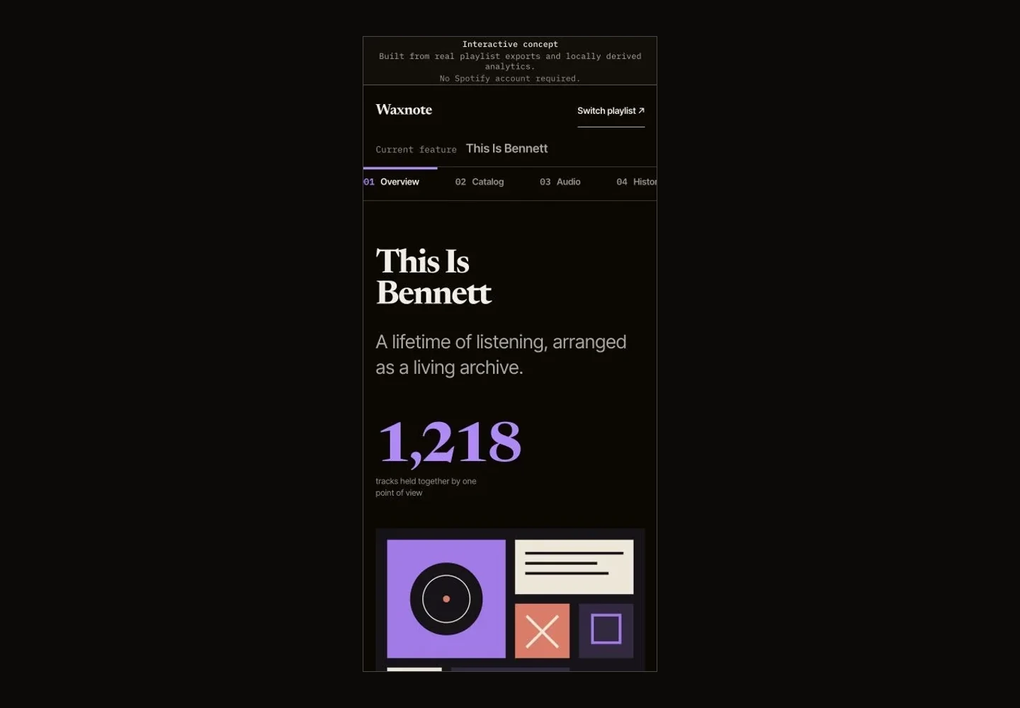
The finished concept
Waxnote became an exploration of how six of my Spotify playlists could become an editorial music experience.